


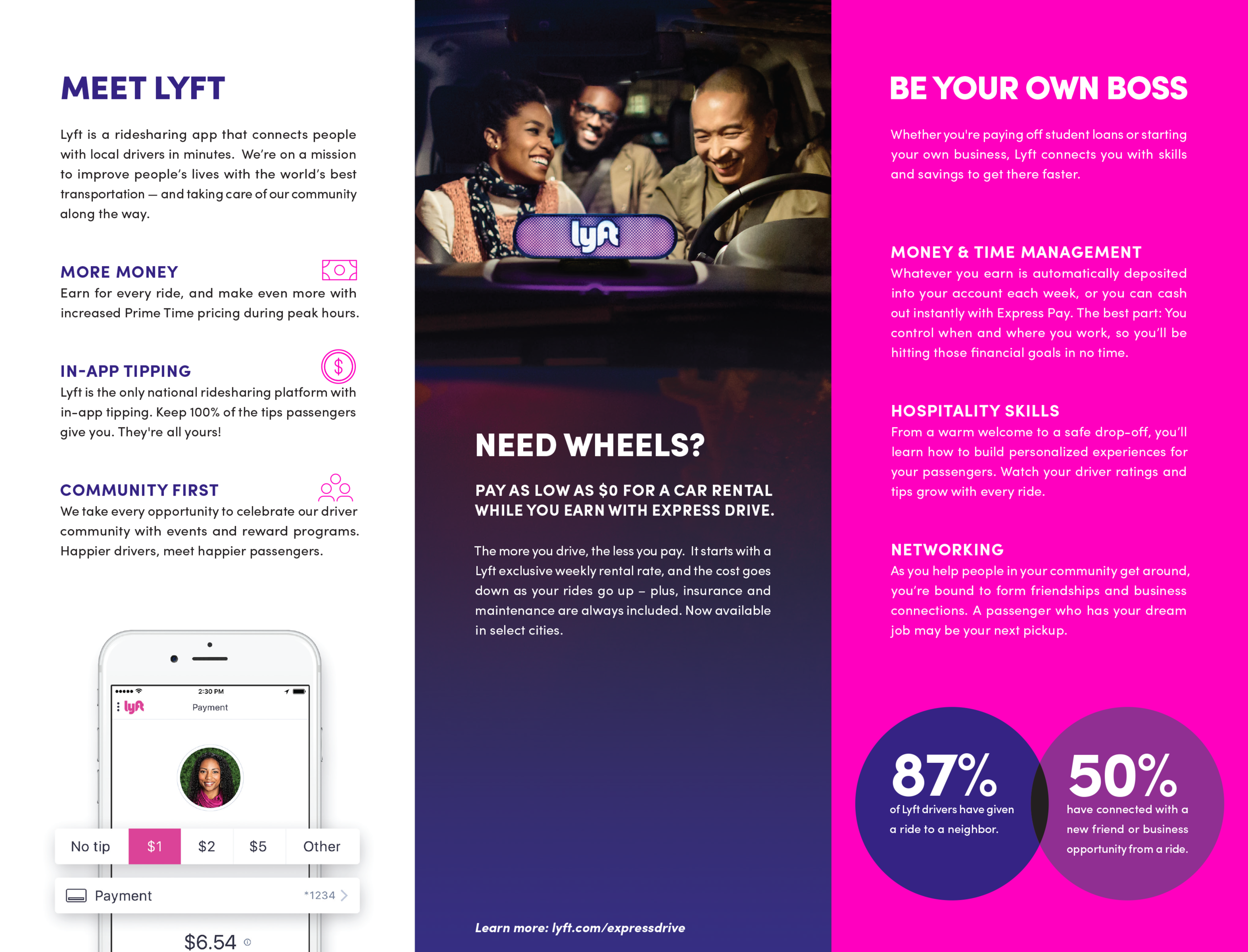


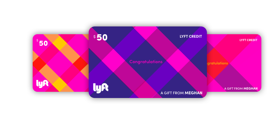


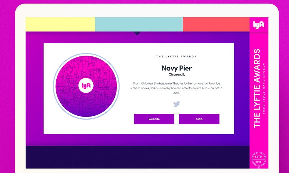


And then there was purple. I believe "Mulberry" made it's debut in the API guidelines while I was on maternity leave, but I soon embraced it's versatility as the ultimate (and more accessible) compliment to our even brighter new shade of Lyft Pink. As we grew, our functions slowly became more specialized, and I spent a lot of time working on ads and building out the performance creative team in addition to art directing, doing interactive design and illustration as well as some identity work. Some representative work in this period is below.
After this phase, I was looking for a change, but not ready to cut the cord. I transferred to the product design team and helped spearhead the Core Design function.